
Data is everywhere today. Just about any piece of software has some way of gathering and displaying data about whatever you’re working on. The news cycle is replete with stories about data, of stories crafted with data. It seems that everybody wants data of some sort. Facebook loves your data. Google, too. Sometimes too much.
But why? Because, with data you can do so much.
With data, you can identify trends; understand users, employees, and consumers; and make decisions. While its ubiquity makes it easy to gather and use in a variety of fashions, data alone doesn’t necessarily inspire real human beings to take real action.
To inspire change, we must connect with our audience and help them understand and emotionally invest in whatever it is we’re trying to accomplish. We may reap clever insights from data, but until we weave data into a cohesive narrative, people will not feel the impetus to act.
That’s where data storytelling comes in.
What is data storytelling?
Data storytelling combines data and insights with narrative and visuals to move people to take interest and, ultimately, take action.
In her article “Data Storytelling: How to Effectively Tell a Story with Data ” on Harvard Business School Online, Catherine Cote identifies three components of a data story: data, narrative, and visualizations.
Data – and the insights gleaned from that data – are the “what” of the story. These are the key messages and actionable insights we want people to get.
Narrative provides the structure of a good story, including classic elements such as character, setting, and conflict. It is the human face that draws the audience in, keeps them interested, and invests them in the outcome.
Visuals help people “see” the data and move them through the story. The visuals should display the data in ways that reveal the insights to the audience and support the main argument, or viewpoint.
Narrative: the Currency of Human Connection
At its most basic level, a narrative is a story that connects and explains a set of events or supports a particular viewpoint. The power of story lies in its ability to create a connection between the teller and the audience.
Stories are a distinctly human construct. We are hardwired to design and share them. They are the functional units of our memories, and help us to explain our world. Consider the way that you converse with your fellow human beings over your favorite hot or cold beverage. It’s not done by listing a series of data points. Instead, it’s an exchange of ideas through stories. These stories generate intimate connections because they fire multiple sections of the brain.
Functional MRI studies have revealed that when you hear (or read) a story, multiple areas of your brain are engaged. Not just the parts of the brain that govern the processing of language, but the parts of your brain that process the senses and the emotions. In fact, where there’s a connected section of the brain, it fires at the telling of a story. When multiple areas of the brain are engaged and working together, short-term memory is triggered, and people are more likely to remember what they heard.
So, in a data story, narrative sells the insights that data reveals. Without narrative, a data story is just a recitation of generally uninteresting, and possibly unrelated, facts. Narrative pulls the facts together and lends them a human face.
Data storytelling uses narrative, or story, as the delivery mechanism for the insights. We not only share the data, but we also create an emotional connection with the storyteller and the ideas.
Basic structure of a narrative
What makes narrative so much more powerful than data alone is its structure. Narrative’s dramatic structure can be used to infuse the story with a bit of suspense and intrigue that grabs the attention of the audience. In data storytelling, we use a dramatic structure to drive support for the insights and ideas we have gleaned from the data.
The most common and useful dramatic structure is Freytag’s Pyramid. Gustav Freytag was a German novelist and playwright who lived in the nineteenth century. While Freytag’s Pyramid was conceived of through fiction and poetry, it applies any form of story.
Freytag originally described five key stages of a story. For our purposes, I’m going to rename a few of the originals and supplement to better fit a business context. If you’re interested in Freytag’s original approach, check out “Freytag’s Pyramid ” on writers.com.
Let’s consider the following stages of a story:
- Context
- Viewpoint
- Action
- Climax
- Conclusion
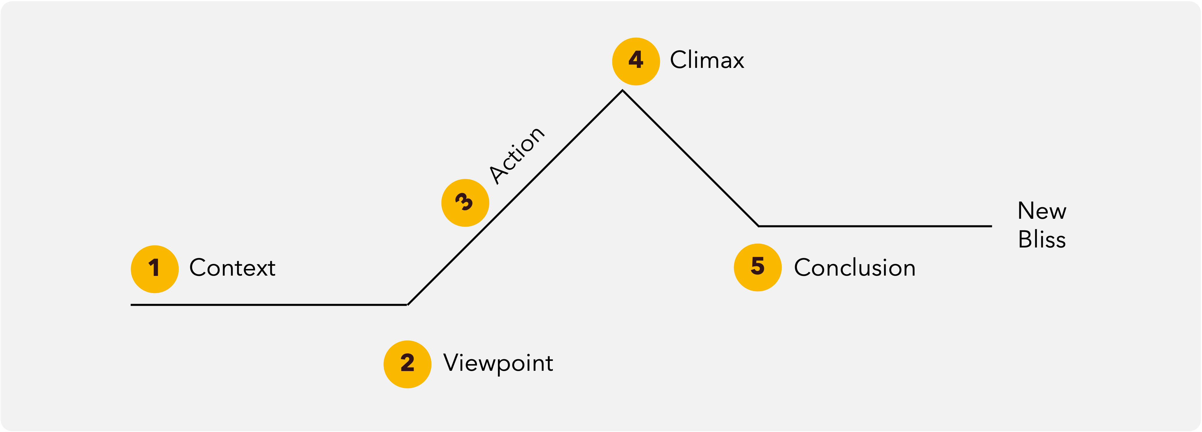
Context introduces the subject and provides the audience the necessary background knowledge they need to understand the story that follows. Context concludes with a statement of the viewpoint (the thesis), or the change that drives the narrative line.
The Viewpoint is what you’re trying to prove through the line of your argument. Remember, you’re trying to convince somebody to take action. This is a form of rhetoric. They need to understand your conclusion, how you arrived at it, and why they should support it.
Action describes the part of the story where you’re attempting to prove your viewpoint by sharing relevant data and insights. Consider possible counterarguments and work to refute them. Lead the audience to a logical conclusion.
The Climax occurs when you’ve made the best case for your viewpoint. It’s the culminating argument and the point where the story turns toward the conclusion.
The Conclusion is what you want the audience to take away; a restatement of the original viewpoint. What do you want them to remember? What action to you want them to take?
A Human Face: Character in Story
Every story, even the driest, has a human face. Draw it well and put it on display, for to readers it is a mirror and a magnet.
One characteristic that I haven’t discussed is character. Character didn’t make the graphic because it’s not part of the dramatic structure, but it strongly influences the story and the way we tell the story.
The most common error creators make when creating data stories is failing to put a human face on it. If you want people to see the relevance of data, they have to see it in human terms. How are real human beings impacted by the trends that we’re seeing?
Character starts with point of view. That point of view can be that of the storyteller, or it can be the experience of a character in the story. When we select a point of view, that becomes the lens through which we’re viewing the events of the story.
It may be advantageous to consider the experience of a real person and use that to illustrate the insights provided with the data. If we choose the point of view of a character, then the action is where we will illustrate the attempts of that character to right their world.
Adding the human element makes it easier for your audience to identify with what’s happening and increases the likelihood they will take something away in the end.
Bottom line: the more you can humanize your data, the better chances that your story will stick.
Putting it all together
Okay, let’s take what we’ve learned and apply it to a hypothetical data story.
Situation
Let’s say you’re scouring employee data for insights and you find that employee engagement is decreasing. You perform the data analysis and determine that a downward trend began shortly after a new policy was implemented. Research confirms that the policy change had unintended consequences that are negatively impacting employee engagement. You need to convey to leadership the effects of the policy change, the potential outcomes it portends, and propose a course of action.
Story Elements
Let’s break it down into the essential elements of a story.
- Character: An affected employee
- Context: Describe what was happening prior to the change and why we chose to make it.
- Viewpoint: The policy change has negatively affected employee engagement and will continue to do so, perhaps affecting retention.
- Action: Using the data and insights, show how the experience has changed and has negatively impacted the employee. In this case, you could use the data to show how the employee’s frustration level has ticked up at a variety of points in their daily work.
- Climax: The change has harmed the employee and we must reverse course.
- Conclusion: The continued course of action will reduce retention, so we need to take a new course of action.
The next step is to build the story with the appropriate visuals. You want to use the right charts and graphs that will effectively illustrate your arguments. Highlight key insights for each chart and graph you present, and humanize those findings as much as possible.
Final Thoughts
Data, and the insights we can glean from it, are powerful tools in our arsenal of rhetorical devices. But they can only get us so far. To get commitment to real change, we have to support our data with a narrative that puts a human face on our argument and illustrates the need to change. It’s only when your audience can connect with your story that you can move them forward.